Tangent Wines
packaging design • photo production • social media • marketing strategy
Tangent Wines is a family-owned wine brand based on the central coast of California, sold in their tasting rooms, wine shops, and national grocery retailers. Working with the Makers & Allies studio, I contributed to the re-brand of Tangent, modernizing their brand presence and brand design, expanding the brand into canned wines, and adding rosé to their varietal offerings. I worked to shape Tangent’s new brand identity and voice through packaging design, brand messaging, social design and management, and content production and direction.


The Packaging
The folks at Tangent wanted their brand to convey light, fun, breezy energy to match the lightness of their varietals — wines you’d drink on a warm day, on a weekend, at a casual friendly picnic, etc. The creative objective for this rebrand was to effectively communicate the desired brand energy where the existing presence fell short.
To modernize and add playfulness and color to the brand, we worked with vibrant watercolor artwork from a local artist. My role included interpreting her paintings into designs for the new Tangent canned wines, including their new rosé. Whereas the bottle design stuck to a gridded layout, for the cans I broke free of the grid and incorporated more ‘splash’ elements, bringing a lively and energetic quality, as well as an eye-catching mix of textures, to the design.


Tangent’s previous brand look


The Content
With the same objective as the new packaging design, I planned the new photography and social content for Tangent to feature rich, vibrant colors and fun, laid-back leisure imagery. In addition to creating the photography assets, our team planned and managed the social content of the Tangent brand. I blended original photography, found work, and user-generated content (including coordinating and managing influencer partnerships) to build the Tangent social presence, and worked with the Makers & Allies copywriting team on crafting the brand voice.
Our content moodboard.
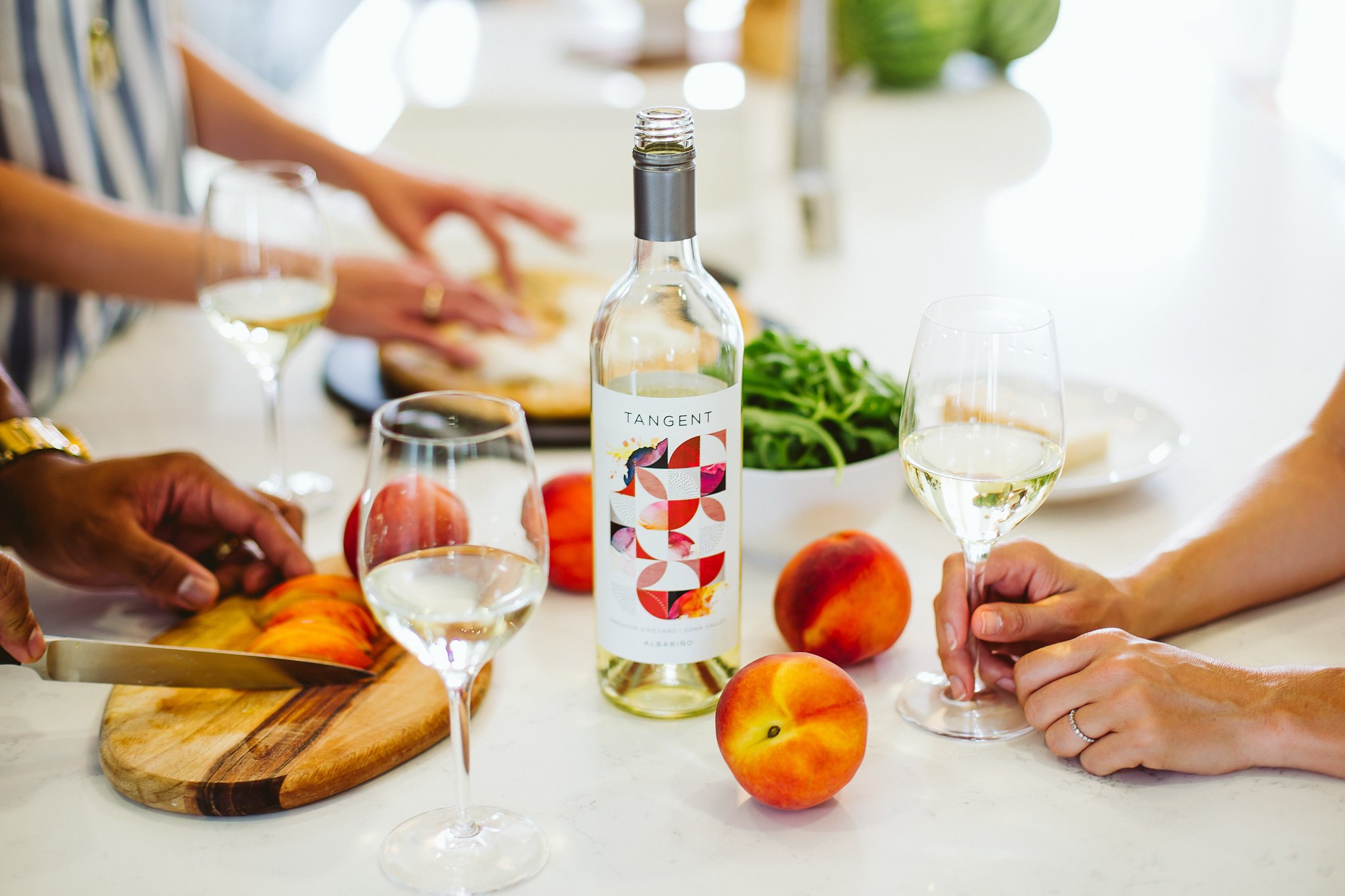
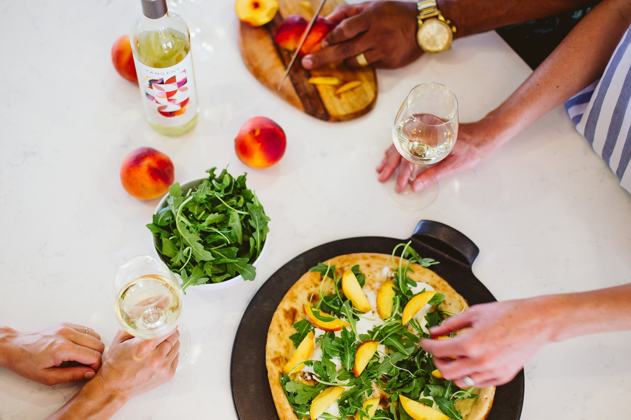
The Photography
Using our mood boards to guide our shot lists, I worked with the creative team, including the studio creative director and photographer, to plan and direct several day shoots at various central coast locations including the iconically rose pink Madonna Inn. In wardrobe, set pieces, and location we incorporated bold colors and geometric patterns to echo the new packaging design. Bright lighting and rich colors added to the energetic and friendly nature of the shoot.


